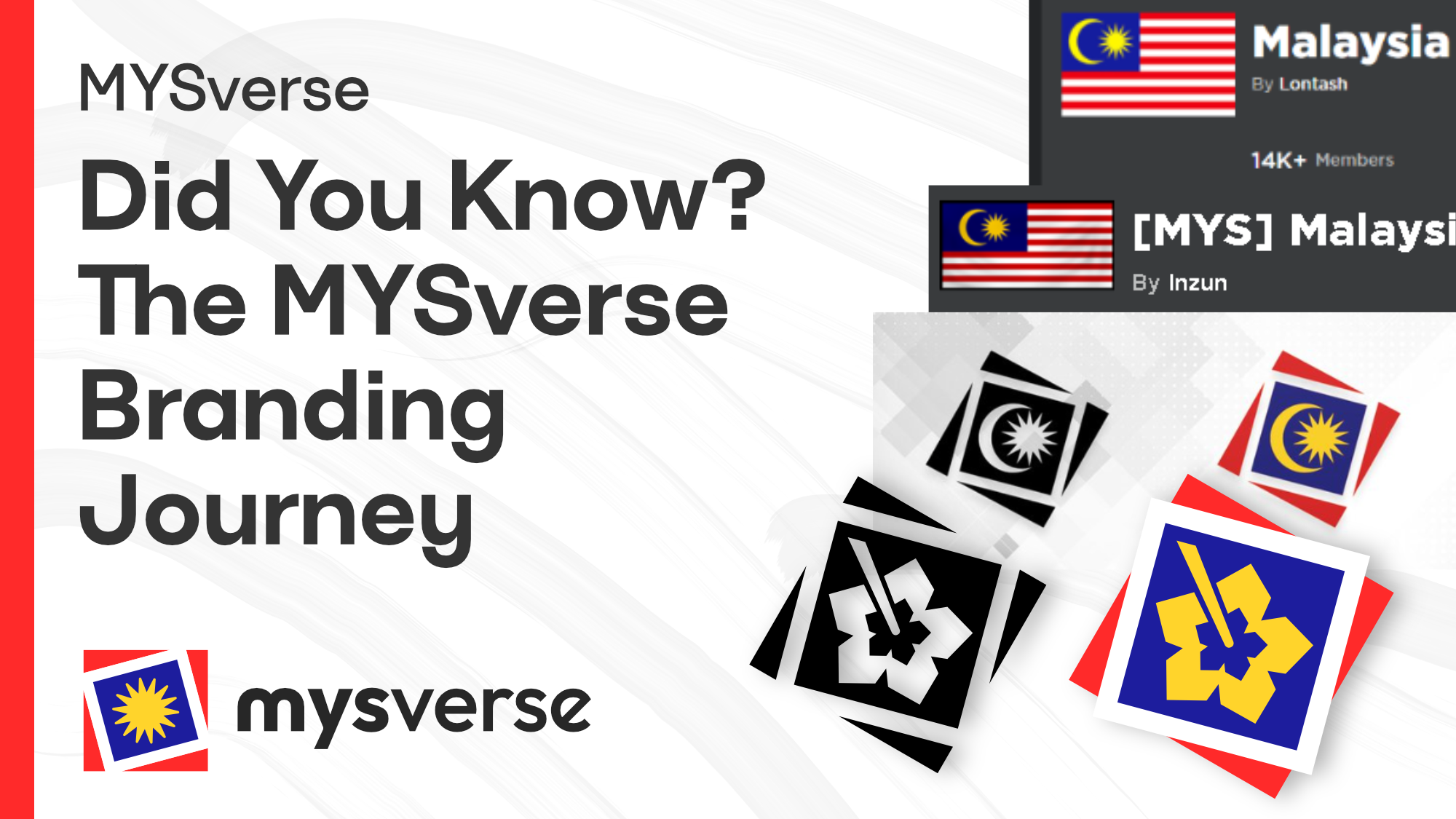
Did You Know? The MYSverse Branding Journey
Discover the evolution of MYSverse's branding in this insightful article by co-founder Yan. Learn about the transition from Lontash's Malaysia to the latest MYSverse logo, the design journey, and the thoughtful approach to cultural and legal considerations in branding.
Hey everyone, it's Yan - co-founder, head admin, senior dev, you know the drill. But I also happen to be the one that designed the branding for MYSverse, and I wanted to explain a bit about how we got here and what the next evolution of our brand may look like.
Historical Branding
From Lontash's Malaysia to [MYS] Malaysia and MYSnet
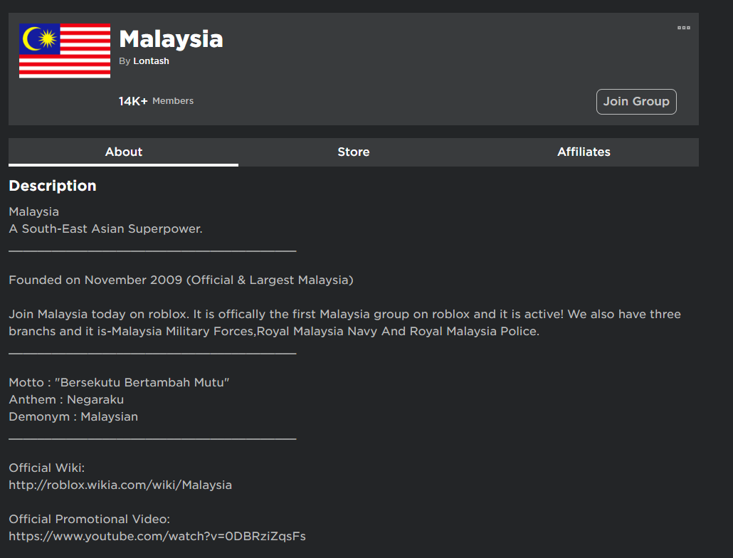
A brief history lesson! The first well-known Malaysian community on Roblox, simply named "Malaysia" was created by a player named Lontash ("Lontash's Malaysia", henceforth LM), sometime in 2009.
The LM group used a simple Malaysian flag with increased saturation and a slightly decreased width, resulting in a brighter and more square-ish look.
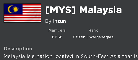
In 2014, co-founder Inzun created a Roblox group named "[MYS] Malaysia" (MYS), the previous iteration of MYSverse, and collaborated with afif99, senior member of LM, to initiate a transition of group members. MYS used a textured, slightly more muted Malaysian flag with a black border, preserving the flag's original aspect ratio.
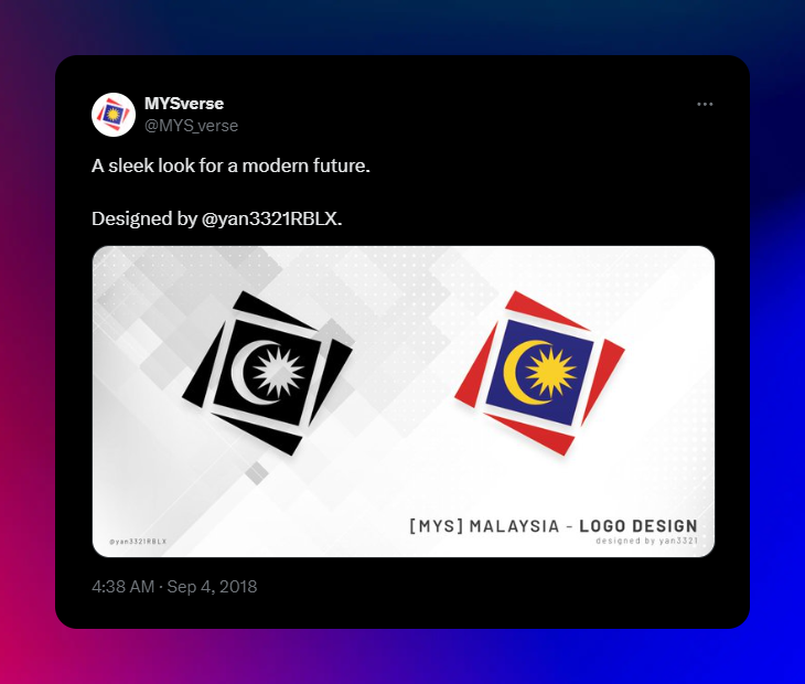
In September 2018, co-founder Yan (@yan3321) created the well-known MYS "square" icon.
The square borders and overall design pay homage to the main platform we were founded and operate on: Roblox. Particularly the -blox (blocks = cubes, squares...) portion.
The 4 triangular borders were designed to signify the 4 co-founders of MYS:
- @Inzun
- @afif99
- @yiheng16
- @yan3321
At the middle stood the primary symbols of the Jalur Gemilang - the crescent and the 14-pointed star. We also adopted the national colours as depicted, the iconic red and white combination, plus the blue and yellow.
In the future, we would find out these symbols that were directly copied from the flag will be problematic as a organisational symbol, but more on that later.
How We Got Here
Exploring the origin of the MYSverse logomark and logotype
I had recently left a full-time(ish) career as a product developer after my contract expired - and decided to pursue a return to this passion project I helped co-found almost 10 years ago.
In all sorts of places, I started thinking really hard about the rebrand. Clearly "[MYS] Malaysia" wasn't going to fly in any business name, and I wanted to think long term. Like really long term. I even mentioned in my announcement on Discord that MYSverse is here to stay, even when our members graduate, get a job, and start a family - that shows the commitment and belief I have in the success of this project.
So obviously, the metaverse was a place to start. I liked aspects of the concept in general - mainly the virtual world part. However, it had some negative connotations as well.
Related to buzzwords like Web3 and crypto, which I acknowledge are technically impressive and promising feats, yet in general they haven't exactly been seen as beacons of positivity in terms of applications. In addition, I had heard that Meta lost a sizable amount on their metaverse push after a while.
Yet, I decided on settling on the "metaverse" term for 2 reasons:
- We planned on focusing on the selected positive aspects of a metaverse that we've been cultivating for the past 10 years, and really focus on the "virtual world" part.
- In Malaysia, the metaverse is a relatively new concept. I believe it hasn't really had time to develop, and with our experience in virtual Malaysian-themed experiences, we believe we could redefine the term locally to be something that emanates success and positivity.
From the outset, our rebranding strategy has been guided by a commitment to positivity and ethical practices. This has led us to steer clear of NFTs and loot boxes. NFTs, while technologically innovative, are shrouded in environmental and value stability concerns. Our approach is to foster sustainability and genuine value, avoiding "hop-on-the-train" kind of trends.
Loot boxes, on the other hand, have been critiqued for their gambling-like mechanisms, particularly among younger audiences. Our stance is to promote responsible gaming, prioritizing the well-being and enjoyment of our community over profit-driven models.
So, we've explained how we came to "metaverse" and how it will be incorporated into our new branding. I began to draft a couple of ideas - the first one was "Myta". Seems simple enough, deriving "My" for Malaysia/mine, and meta-verse. I also put it together with "Blox", obviously referencing the platform we were built on (but have plans to expand beyond!)
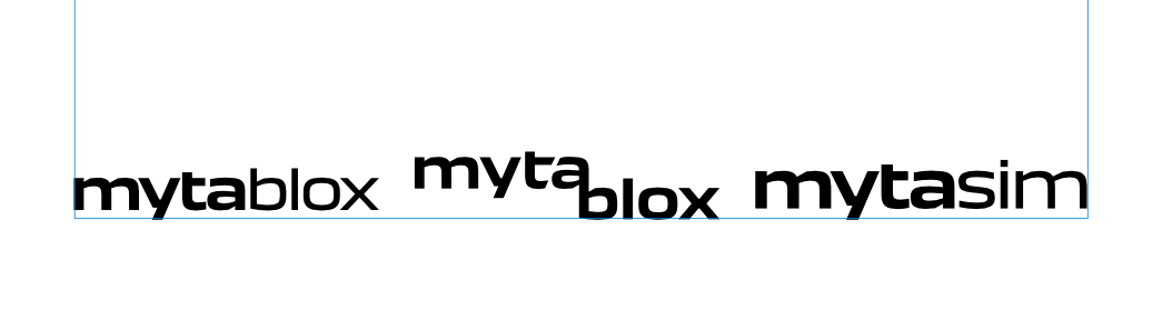
In the end, Myta didn't pan out after doing some online research and finding other usages in businesses. Also, we felt it would be challenging to get the existing MYS community to adapt to it. And to me, it just sounded kind of "off".
With the "meta-" portion considered, time to move on to the latter: "-verse".
This was simple enough. "MYS" and "MY" were both contenders for preceding words, since they both related to Malaysia, personal choice and customisation, and the existing [MYS] Malaysia name. I decided to leave that discussion for later, with the rest of the development and administration team, and I started drafting some logos based on the existing MYSnet branding.
Around the same time as the drafting process, we did some research regarding the usage of Jalur Gemilang elements, primarily this article from Vulcan Post.
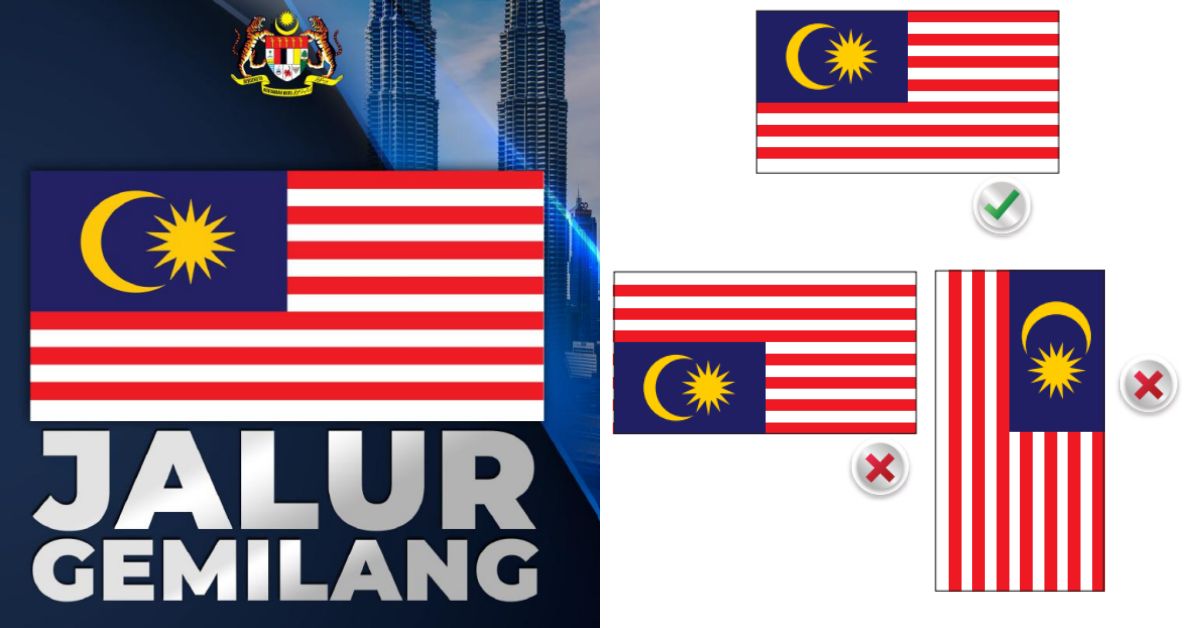
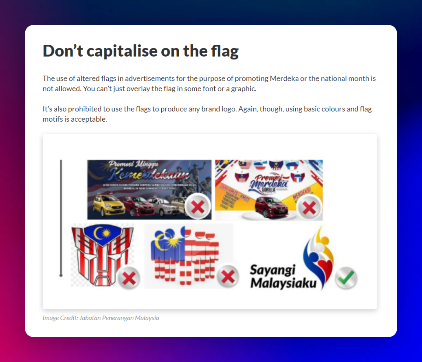
According to the examples laid out by this particular section of the article, we realised that it may be extremely problematic for us to directly use the crescent and star from the flag in our brand, which was the case for the previous MYS icon.
As the eventual logo selected did not include the crescent, I would like to personally stress that this was due to the aforementioned issue of compliance with the law and the guidelines as set out by Jabatan Penerangan Malaysia, and no elements of religion were involved in the decision-making process.
With that being clarified, let's move on to the drafts and the concepts!
Phase 1: The Logomark
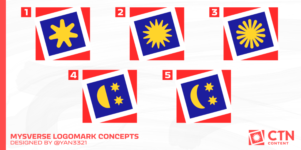
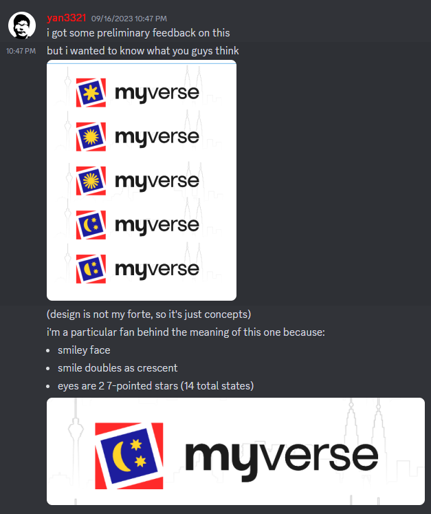
Let's start by rationalising each of these designs.
- Rounded 7-pointed star
- Inspired by the asterisk (*) character
- Derived from the 14-pointed star on the Jalur Gemilang, but simplified
- How do we simplify it? Divide that by 2, and you got 7!
- Rounded edges contrast with the sharp square container and borders
- Near-original 14-pointed star
- While this looks practically identical to the Jalur Gemilang star, it was actually generated manually in design software
- Bigger inner radius/circle, resulting in much shorter edges (they don't extend to the centre of the star)
- The tips of the star are slightly rounded off and flattened at the ends
- While this looks practically identical to the Jalur Gemilang star, it was actually generated manually in design software
- Rounded, inverse 14-pointed star
- Inverse of the Jalur Gemilang star, with thick ends that thin out as you approach the centre
- Somewhat inspired and looks like a sun
- Half-moon and 2 stars
- Since a crescent may be construed as a Jalur Gemilang element, we used another moon stage - a half moon
- The Jalur Gemilang's 14-pointed stars are split into 2, smaller 7-pointed stars
- The moon and stars are arranged similar to a "face", coincidentally resembling a Roblox-style cosmetic
- Stars are arranged side-by-side on top, resembling 2 eyes
- Below is the half moon with the flat side up, resembling a smiling mouth
- Crescent and 2 stars
- Identical to 4, with a crescent instead
- The crescent is generated in design software with soft, rounded edges and a slightly smaller angle/radius
- Still preserves the same meaning of a smile as 4
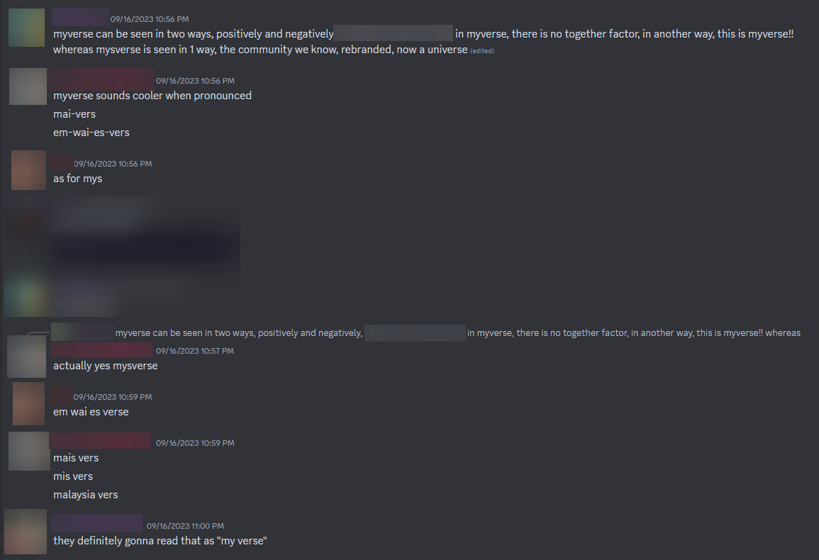
With the concepts ready, I started getting feedback over the Hornbill Interactive (developer) Discord server, the discussions of which you may refer to below:
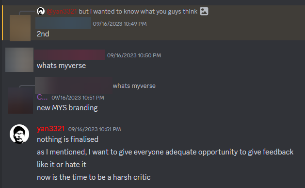
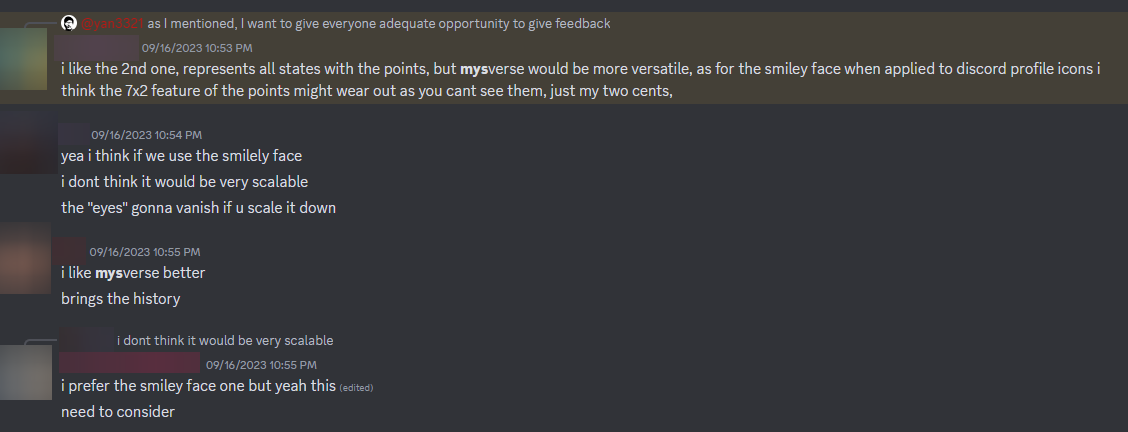
Response to and discussion of the MYSverse concept logos over the Hornbill Interactive Discord server
So, it was settled - we would proceed with the 2nd concept through majority agreement. Also, the keen-eyed among you may have noticed these discussions took place on 16 September, 2023. Malaysia Day - how apt!
Now for the next part, the name.
Phase 2: The Name
In the earlier section discussing about metaverse concepts, I've mentioned how we came to incorporate "MY"/"MYS" and "verse" into our new name, and brought this up to the rest of the team. You can see how that went in the Discord conversations below:
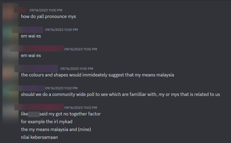
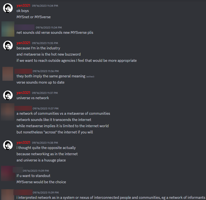
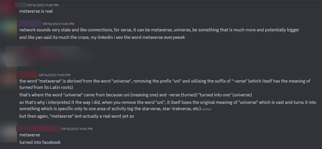
Discussion of the MYSverse name over the Hornbill Interactive Discord server
So the consensus was to ditch "MY", and adopt "MYS", resulting in the agreement on "MYSverse". Onto the logotype then!
Phase 3: The Logotype
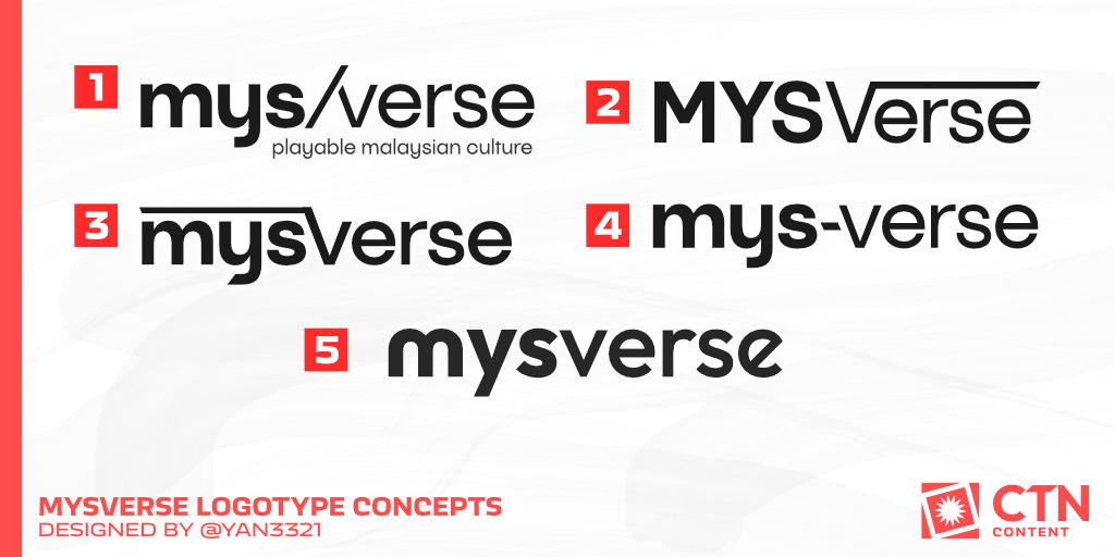
Okay - not much in terms of the method to the madness here. This was mainly a question of aesthetics, and almost as it always does, simplicity wins out in the end - number 5.
I used Outfit (free Google Font, btw) in full lowercase. I did try uppercase but felt it would break the height consistency (while totally ignoring the lowercase "y" would do that anyways).
For the "MYS" portion, I gave it a slightly larger font weight (bolder) than the "verse" portion to give it a subtle separation. I switched up alternate characters for the first and the second "e", ending it on one slightly angled upwards which signifies MYSverse's trajectory of growth. Up, up and only up!
...no, I absolutely did not make that rationale up while typing this article at 12.30am. Why would you think that?
Finalised Logo = Logomark + Logotype
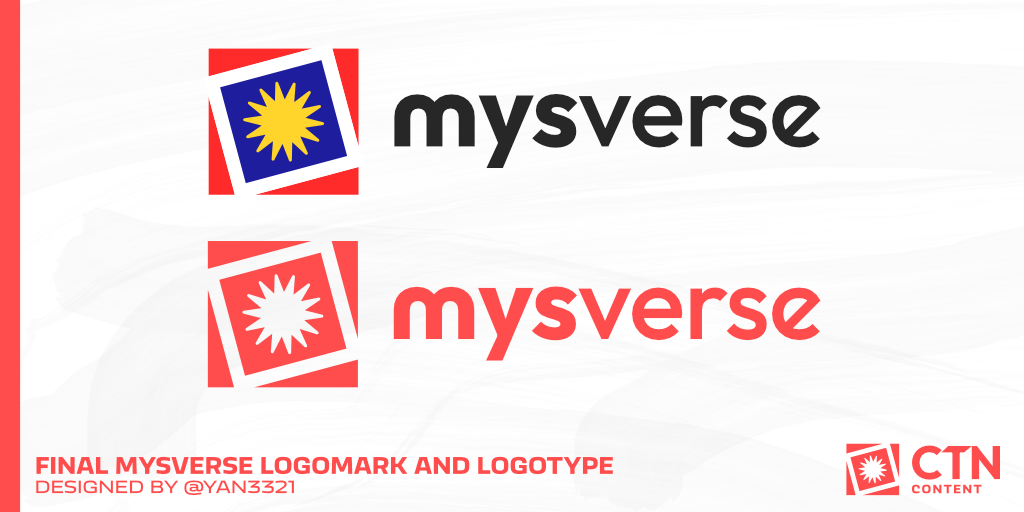
By combining the logomark and the logotype, you get the final MYSverse logo - a versatile and adaptable visual brand indicator applicable to many uses within and outside the community.
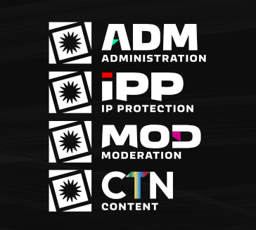
It can be used in any of the internal MYSverse teams and organisations...
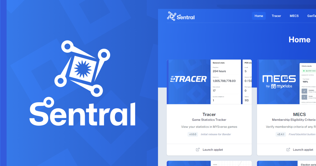
And with some slight adaptations, into other MYSverse-related products and applications such as the Sentral companion web app!
Emblematic Evolution
Building an identity for the long-term
Even though we agreed and adopted the current MYSverse logo through an internal discussion and majority agreement process, we recognise that it still isn't perfect.
It still incorporates a visually identical element to the Jalur Gemilang, although it is not the exact one, in addition to the fact that our process was not open and community-oriented as we'd like. In addition, there was the potential for the missing crescent to be miscontrued as something else.
In response to that, Deputy Head Administrator @yiheng16 started a poll directed towards our Discord community in December 2023 to discuss a potential replacement.
2 concepts were presented:
- A geometric, minimalist and modern hibiscus I designed for one of my previous projects, which retains the square borders and containers of the MYS and MYSverse logo lineage
- A rounded square intersecting an inner shield border, containing a rounded and slightly more detailed hibiscus designed by another administrator
The hibiscus was chosen due to its status as the national flower of Malaysia - a fitting replacement as a symbol of our community, the themes and cultures it represents.
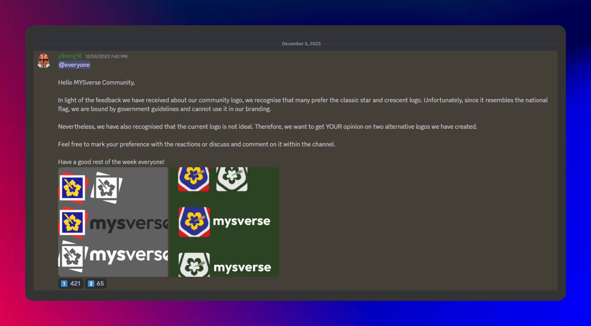
The majority of the community preferred the first option. While no announcements or updates have been made since then, we were occasionally reminded to discuss the progress of its adoption internally, and this blog post serves as an announcement of sorts...
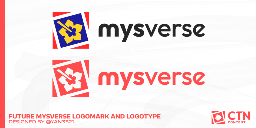
The MYSverse Administration has agreed on adopting the modern "hibiscus" branding to replace the current "star" branding moving forward.
The adoption process is expected to start in April 2024 and will be gradually applied to not only the MYSverse brand itself, but the internal teams, products, MYSverse Sim organisations and their sub-organisations... as you can tell, there's a lot for our dedicated volunteers to change.
We may make another announcement or blog post when those changes are made. But for now, we are happy that we have found a replacement and the next generation of our logo that still represents Malaysia, Roblox, our communities' identity, without having to worry about law-related concerns!